Creating a corporate identity for an international group of engineering companies presents a significant challenge. Ten offices spread across various countries, more than 5,000 employees, and a robust marketing department. Adding to the complexity was an owner who had nurtured his successful "empire" for a quarter of a century and held a strong affinity for the existing logo, while also understanding the pressing need for an update. The Spectrum Group project exemplified this. We will share the story of how the client relationship was established, the process of developing the corporate style design, and the level of involvement of the client's representatives.
A well-crafted brief is fundamental to a successful corporate identity development. Unfortunately, many clients approach this stage superficially. Their responses are brief, questions are overlooked, and generalities prevail. According to Aija Chmil, project manager at 3CUBA: "We often find ourselves in a situation where, after presenting initial logo design concepts that are subsequently rejected by the client, we are forced to backtrack and restart the project by discussing their goals, objectives, and expectations anew." This clearly highlights the time and resource wastage resulting from a neglected brief.
But the Spectrum Group project was a welcome exception. Our agency could hardly recall a more detailed brief in terms of general information, competitive environment, marketing objectives, and strategic planning. The document, which usually takes up two or three pages, expanded to almost ten. Furthermore, it was accompanied by multi-page reports from foresight sessions on the company's strategic development and management. But the main point Spectrum Group's marketing department conveyed was in the following sentences: "Active participation in investment markets, infrastructure development, and real estate in Russia, Europe, and Asia. Our benchmarks – Arup, Aecom, Buro Happold – are the world's top engineers.
"Maintaining visual continuity was important for the client. We understood that offering options radically different from the current version of the logo would be a waste of time," notes Alexander Ushakov, creative director of the 3CUBA agency. His words underscore a strategically sound approach focused on the evolution, rather than the revolution, of the brand, which helped avoid unnecessary iterations and concentrate on developing recognizable elements.
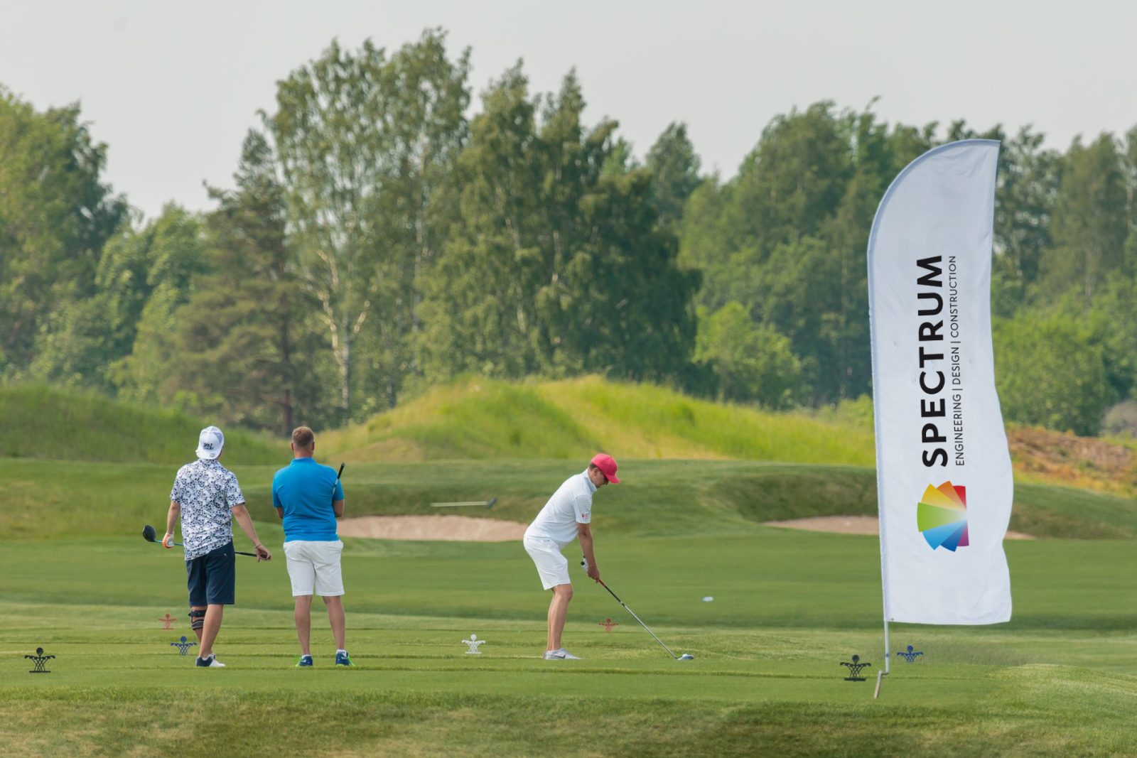
Given the name Spectrum and the wide array of services the company provides, the decision to retain a broad color palette became a logical visual strategy for the designers and marketers.
Our agency's standard practice for the first presentation involves offering three conceptually different logo designs. We illustrate potential usage, provide rationale for each, point out advantages and disadvantages, explain the intended positioning, and forecast market reaction. In this case, the client faced a decision deadlock between two concepts. Their proactive approach involved subjecting these options to three focus groups, with the final logo selection based on the resulting market research. The rationale behind three groups was the marketing department's desire for a cross-demographic perspective, encompassing the younger generation, middle management, and top executives. Open voting determined the winning design. Subsequently, the client took the prudent step of consulting an independent patent agency to ensure the new logo's uniqueness and secure its trademark registration.