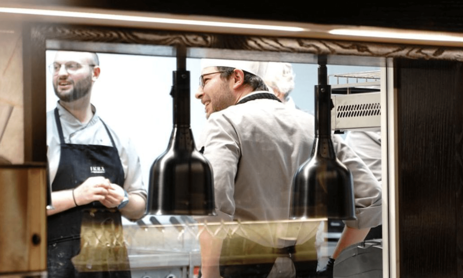
Before opening a restaurant in the German part of the Swiss Alps, the client came to us with a ready-made name. "The restaurant will be called Irka" - this phrase was the assignment for the development. There were no briefs, no special references, and no market research. Okay, let's do it!
Despite the Russian origin of the word "Ikra" ("caviar") the cult institution was not supposed to be associated with Russian cuisine and fish restaurant. The project is being created with an eye toward haute cuisine and a broad wine list. The institution will work as a business lunch in the daytime and as an a la carte restaurant in the evening and at weekends.
"There were no restaurants among the cases of our agency, - says Alexander Ushakov, creative director of the agency 3CUBA. - It was a certain challenge for us."
The search for a visual image began around the city symbols of St. Gallen. After the first sketches, we realized that the traditional Swiss ornaments and signs of this canton did not fit well with the marketing concept of the brand. "We foresaw this result and warned our customer about it, but the restaurant owner wanted to see for himself," says Aija Chmil, 3CUBA project manager. - As a result, on the one hand, the result of two weeks of work was in the trash garbage can, on the other hand, it strengthened our professional credibility in the eyes of the client, which allowed us to efficiently organize the further work process. The second approach to finding a visual identity for the restaurant's brand could have been a monogram. "The four-letter name is very convenient in terms of building typography," says Alexander Ushakov. The customer liked the idea, but the marketing department of the Ikra restaurant was against it: too respectable and aristocratic. Modern restaurants do not use monograms or heraldry - this is too archaic.
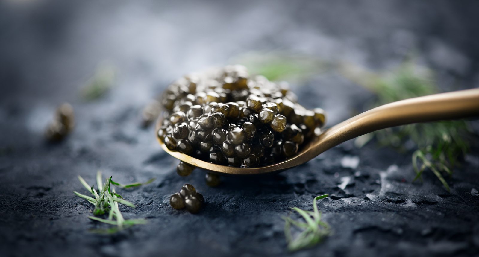
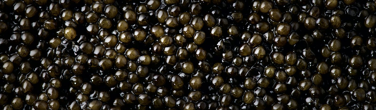
As a result, the creative team of 3CUBA insisted on the need to build the brand concept around the image of caviar. At the same time we agreed that the symbol of caviar should not be trivial. The difficulty in developing a visual image was the lack of an approved interior design.
"On the one hand, we had an opportunity to tie the interiors and elements of the identity together," tells Aija Chmil. - But on the other hand, we didn't fully understand what kind of restaurant it would be. You work blindly: there is no final concept of the interior or the cuisine. But for all that, you feel that the customer is aiming for the top level, and that's inspiring!"
The logo was born after two months of working together. We decided on the letters fairly quickly, using one of the classic Antiqua group fonts as the basis. "The idea of integrating the image of the caviar into the text part was on the surface. But it was decided to give the caviar an irregular shape after studying the biological process of its formation," said lead designer Artem Baidin. Subsequently, copper was approved as the corporate color. This material is widely used in the interior and successfully blended with the color of real caviar.
The customer was delighted with the concept of the logo. Further work on the development of the identity was already a matter of technique. Irregular shape of caviar and copper color became the basis of branding. One of the key elements was signboard, made completely of copper with internal illumination. The menu was given a corporate image, as well as tableware - plates. The idea to make tables in the shape of branded caviar at first seemed like a great continuation, but later functionality took precedence over aesthetics.